Recoil에 들어가기 전...

카테고리 Daily

상태란?

상태(state)는 애플리케이션의 작동 방식을 설명하는 모든 데이터를 말한다. 상태 관리는 시간의 흐름에 따라 상태가 변경되는 방식이다.

상태 관리를 위해서는 다음 기능이 필요하다!

  • 초기값(initial Value)을 저장할 수 있어야 한다.
  • 현재 값(Current Value)을 읽을 수 있어야 한다.
  • 값을 업데이트 할 수 있어야 한다.

React 상태관리의 한계

  1. 컴포넌트 상태는 연관된 상위 컴포넌트까지 끌어올려야 공유가 가능하고 이 과정에서 Props Drilling 이슈가 발생하고 불필요한 리렌더링 발생한다. (성능저하)

  2. Context로 Props Drilling 이슈 해결할 수 있지만, Context는 단일 값만 저장할 수 있고 여러 값들의 집합을 담기가 어렵다.

  3. React의 Context, Props 만으로는 최상단에서 최하단 까지의 state 코드 분리가 어렵다.

Recoil 장점

유연한 상태 공유

Redux처럼 복잡한 과정이 없다. 간단한 get/set 인터페이스를 사용해 상태 공유가 쉽다.

파생된 상태

데이터는 간단하고 또 안전하게 상태나 다른 파생된 데이터로부터 파생될 수 있다. 또한, 상태에 접근하는 방법과 동일하게 파생된 상태에 접근 가능하다.

파생된 상태는 동기, 비동기 처리가 가능하다.

광범위한 앱 상태 관찰

Recoil 상태의 전체 또는 일부의 상태를 읽거나 상태가 변경된 것을 감지할 수 있다. 앱의 상태를 유지할 수도 있고 다시 수화(Hydration)하는 기능을 제공한다.

비교적 낮은 러닝 커브

Recoil은 React API와 유사하여 Redux에 비해 쉽고 Recoil은 기본적으로 비동기 처리 기능을 가진다.

Recoil 핵심 개념

1. atoms

  • atoms은 공유 상태
  • 컴포넌트가 구독할 수 있는 상태 단위

atom은 상태단위이며 구독과 업데이트가 가능하다. atom이 업데이트되면 구독중인 컴포넌트는 새 값을 반영해 다시 렌더링된다.

1
2
3
4
const authUserState = atom({
key: "authUserState",
defualt: null,
});
  • atom은 고유한 key를 가져야 한다.
  • default 속성으로 초깃값 설정한다.

컴포넌트에서 atom을 읽거나 쓰려면 useRecoilState 훅을 사용한다.

1
2
3
4
5
6
7
function SignIn() {
const [authUser] = useRecoilState(authUserState);

return (
!authUser ? <SignInForm /> : <Browse />;
);
}

뿐만 아니라 상태 업데이트를 위한 업데이트 함수만 추출할 수 있다.

1
2
3
4
5
6
7
8
9
10
11
12
13
14
function SignInButton() {
const [, setAuthUser] = useRecoilState(authUserState);

const handleSignIn = () => {
// ...
setAuthUser({ name, email });
};

return (
<button type="button" onClick={handleSignIn}>
로그인
</button>
);
}

2. selectors

selector는 atom이나 다른 selector를 입력받아 파생된 상태를 생성하는 순수함수이다. 상위의 atom, selector가 업데이트되면 하위의 selector도 다시 실행된다. 컴포넌트는 atom과 마찬가지로 selector가 변경되면 다시 렌더링된다.

최소한의 상태만 atom에 저장하고 selector로 파생된 상태를 효과적으로 계산하여 불필요한 상태 보존을 방지한다.

selector는 어떤 컴포넌트가 필요로하는지, 어떤 상태에 의존하는지 추적하므로 함수적인 접근 방식을 매우 효율적으로 만든다.

1
2
3
4
5
6
7
const authUserNameState = selector({
key: "authUserNameState",
get:({ get }) {
const authUser = get(authUserState);
return authUser.name;
},
});
  • get 메서드 내부의 get함수는 atom 또는 다른 selector를 전달받을 수 있다.
  • 전달받게 되면 자동적으로 종속 관계가 생성되며 참조했던 다른 atom, selector가 업데이트 되면 다시 실행된다.

댓글 공유

createPortal 사용하여 접근성 높인 모달 구현하기

1
2
3
4
5
6
7
8
9
10
11
12
13
14
15
16
17
18
19
20
21
22
23
24
25
26
27
28
29
30
31
32
33
34
35
36
37
38
39
40
41
42
43
44
45
46
47
48
49
50
51
52
53
54
55
56
57
58
// Modal.tsx
import { useEffect } from "react";
import { createPortal } from "react-dom";

function Modal({ onClick }: { onClick: () => void }) {
const handleModalClose = (e: KeyboardEvent) => {
if (e.key !== "Escape") return;
onClick();
};
useEffect(() => {
document.body.style.cssText = `position: fixed; top: -${window.scrollY}px`;
return () => {
const scrollY = document.body.style.top;
document.body.style.cssText = `position: ""; top: "";`;
window.scrollTo(0, parseInt(scrollY || "0") * -1);
};
}, []);

useEffect(() => {
document.addEventListener("keyup", handleModalClose);
return () => document.removeEventListener("keyup", handleModalClose);
});
return createPortal(
<div>
<article role="dialog" aria-modal="true" className="Dialog">
<header className="Dialog__header">
<h2>React 포털로 연 다이얼로그(with 모달)</h2>
</header>
<div className="Dialog__body">
<p>여기가 React 앱 밖의 세상인가요?!</p>
</div>
<footer className="Dialog__footer">
<button
type="button"
className="closeButton"
aria-label="모달 다이얼로그 닫기"
title="모달 다이얼로그 닫기"
onClick={onClick}
>
<svg
width="24"
height="24"
xmlns="http://www.w3.org/2000/svg"
fill-rule="evenodd"
clip-rule="evenodd"
>
<path d="M12 11.293l10.293-10.293.707.707-10.293 10.293 10.293 10.293-.707.707-10.293-10.293-10.293 10.293-.707-.707 10.293-10.293-10.293-10.293.707-.707 10.293 10.293z" />
</svg>
</button>
</footer>
</article>
<div className="Dialog__dim" onClick={onClick}></div>
</div>,
document.getElementById("modal") as HTMLElement
);
}

export default Modal;
  • createPortal로 root 태그가 아닌 새로운 id가 modal인 태그에 modal을 생성하였다.
  • Esc 키를 눌러 모달을 끌 수 있게 하였다.
  • 모달이 열려있을 때, 모달 뒤의 배경이 스크롤되지 않도록 하였다.
1
2
3
4
5
6
7
8
9
10
11
12
13
14
15
16
17
18
19
20
// App.tsx
import { useState } from "react";
import "./App.css";
import Modal from "./Modal";
import ModalBtn from "./ModalBtn";

function App() {
const [modalOpen, setModalOpen] = useState(false);

const handleModalOpen = () => setModalOpen(true);
const handleModalClose = () => setModalOpen(false);
return (
<div className="App">
<ModalBtn onClick={handleModalOpen} modalOpen={modalOpen} />
{modalOpen && <Modal onClick={handleModalClose} />}
</div>
);
}

export default App;
  • ModalBtn을 클릭하여 모달을 열 수 있게한다.
1
2
3
4
5
6
7
8
9
10
11
12
13
14
15
16
17
18
19
20
21
22
23
24
25
26
27
28
29
30
31
32
33
34
// ModalBtn.tsx
function ModalBtn({
onClick,
modalOpen,
}: {
onClick: () => void;
modalOpen: boolean;
}) {
return (
<div className="box">
<button
type="button"
className="openDialogButton"
aria-haspopup="dialog"
aria-label="모달 다이얼로그 열기"
title="모달 다이얼로그 열기"
onClick={onClick}
tabIndex={modalOpen ? -1 : 0}
>
<svg
width="24"
height="24"
xmlns="http://www.w3.org/2000/svg"
fill-rule="evenodd"
clip-rule="evenodd"
>
<path d="M14 4h-13v18h20v-11h1v12h-22v-20h14v1zm10 5h-1v-6.293l-11.646 11.647-.708-.708 11.647-11.646h-6.293v-1h8v8z" />
</svg>
</button>
</div>
);
}

export default ModalBtn;
  • ModalBtn에 모달 상태를 전달하여 모달이 열려있다면 모달 배경에 포커스가 가지 않도록 하였다.

배경 요소에 모든 focus 요소에 tabIndex 속성을 설정해줘야하는 번거로움이 있다.

댓글 공유

1
2
3
4
5
6
7
8
9
10
11
import styled from "@emotion/styled";

const StyledButton = styled.button`
width: 100px;
height: 50px;
color: ${(props) => (props.isClicked ? "green" : "white")};
`;

function Btn() {
return <StyledButton isClicked>선택하기</StyledButton>;
}
  • 위와 같이 사용하게 되면 StyledButton 에 커스텀 props를 타입 선언을 해주지 않았기 때문에 에러를 발생한다.

이를 해결하기 위해 커스텀 props 타입을 단언해주면된다.

1
2
3
4
5
6
7
8
9
10
11
12
13
import styled from "@emotion/styled";

const StyledButton = styled.button<{ isClicked: boolean }>`
width: 100px;
height: 50px;
color: ${(props) => (props.isClicked ? "green" : "white")};
`;

function Btn({ isClicked }: { isClicked: boolean }) {
return (
<StyledButton isClicked={isClicked}>선택하기</StyledButton>
);
}

댓글 공유

image sprite 실전 사용기

카테고리 Daily

image sprite 실전 사용기

기존 프로젝트에서는 돋보기 아이콘을 불러올 때, png 파일을 통해서 각각 한개씩 불러왔다.

이렇게 되면 돋보기 이미지는 상태에 따라 default, focus, disabled 총 3가지 상태를 가진 이미지가 있기 때문에 이미지를 3번 불러와야한다.

하지만 이미지 스프라이트를 사용하면, image sprite를 사용하여 3가지 상태의 이미지를 svg 파일 한 곳에 넣어두고 이를 배경이미지로 불러와서 원하는 위치의 이미지에 position을 주어 보여주도록 하였다.

1
2
3
4
5
img {
width: 46px;
height: 44px;
background: url("img_navSprites.png") 0 0;
}
  • 이미지를 배경으로 불러온 뒤 left, top 속성으로 배치한다.
1
2
3
4
5
6
7
function App() {
return (
<div>
<img src="img_trans.png" >
</div>
)
}
  • src 속성을 비워두게 되면 img 태그에 테두리가 생기게 되는데, 이는 제거하려해도 제거할 수가 없다. (border, outline, padding, margin 여러 방법을 써봐도 안됐다.)

그래서 src 속성을 비워두지 않기 위해 투명한 이미지 경로를 넣어준 것이다.

1
2
3
.next {
background: url("img_navSprites.png");
}
1
2
3
4
5
6
7
8
// 또는 img 태그 대신 i 태그 사용하기
function App() {
return (
<div>
<i className="next">
</div>
)
}

오늘 프로젝트를 진행하면서 icon을 불러오는 용도로 사용했기 때문에 img 태그 대신 i 태그를 사용하여 불러오니 src 속성없이도 불러올 수 있어서 편리하였다.

댓글 공유

리액트에서 이미지 넣기

1. import 구문 사용하기

1
import Logo from "./assets/img/Logo.png";

컴포넌트에서 import 구문을 사용하여 이미지를 불러올 수 있다.

이렇게 불러온 이미지는 img 태그의 src 속성에 할당한다.

1
2
3
4
5
6
7
function App() {
return (
<div>
<img src={Logo} alt="Logo">
</div>
)
}

단, import는 React가 처리하지 않는다는 것을 명심해야한다. 이는 Webpack이나 vite같은 번들러들에 의해 처리된다.

2. public 폴더에 이미지 불러오기

1
2
3
public
|__images
|__logo.png

다음과 같이 public 폴더에 images를 담아두고 public 폴더를 절대경로로 이미지를 불러올 수 있다.

1
2
3
4
5
6
7
function App() {
return (
<div>
<img src="images/logo.png" alt="Logo">
</div>
)
}

댓글 공유

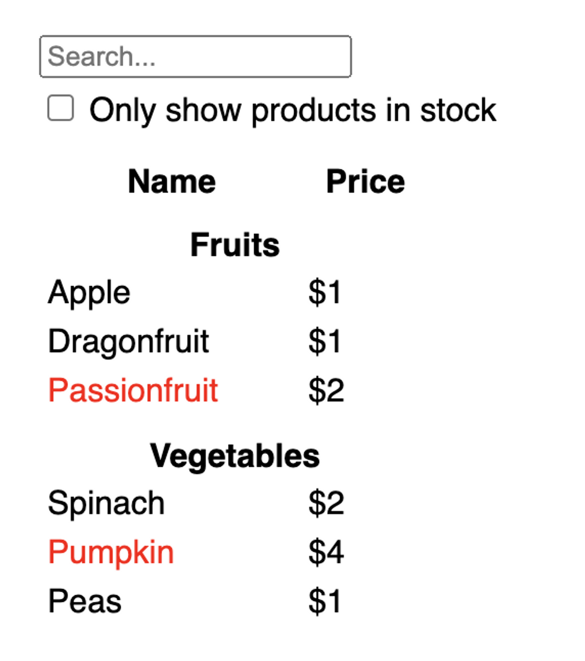
데이터와 디자인을 컴포넌트로 구성하기

1
2
3
4
5
6
7
8
[
{ "category": "과일", "price": 1920, "stocked": true, "name": "사과" },
{ "category": "과일", "price": 1640, "stocked": true, "name": "두리안" },
{ "category": "과일", "price": 2480, "stocked": false, "name": "아보카도" },
{ "category": "채소", "price": 1700, "stocked": true, "name": "시금치" },
{ "category": "채소", "price": 2800, "stocked": false, "name": "호박" },
{ "category": "채소", "price": 1330, "stocked": true, "name": "완도콩" }
]

design

위와 같이 데이터와 디자인 시안이 제시되었을 때, 컴포넌트를 어떻게 구성하는 것이 좋을지 생각해본다.

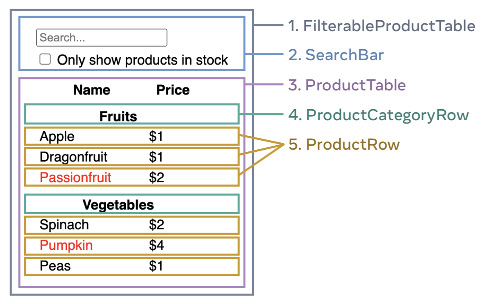
UI와 데이터는 주로 동일한 모양을 갖기 때문에 데이터 구조와 컴포넌트 구조가 자연스럽게 매핑된다.

그러므로 다음과 같이 컴포넌트를 구성할 수 있을 것이다.

component

1
2
3
4
5
FilterableProductTable
├── SearchBar
└── ProductTable
├── ProductCategoryRow
└── ProductRow

폴더 구조는 위와 같이 구성할 수 있을 것이다.

이상적인 컴포넌트 설계는 한가지만 책임하는 것이다. 만약 한가지 이상의 처리가 필요하다면 컴포넌트를 더 작은 컴포넌트로 나눠야한다.

React 정적 컴포넌트 구성

컴포넌트에 대한 구상이 끝났으므로 React로 앱을 빌드해보자.

이 때 가장 간단한 접근법은 사용자와의 상호작용은 고려하지 않고 데이터 모델에서 UI를 렌더링 하는 버전으로 작성하는 것이다.

데이터 모델을 렌더링하는 앱을 만들고자 한다면 props와 state를 사용하고 싶을 것이다. 하지만 현재 단계에서는 state를 사용하지 않는다.
왜냐하면 state는 사용자와 상호작용할 때 사용하기 때문에 아직 단계가 아니다.

1
2
3
4
5
6
7
8
9
10
11
12
13
14
import PRODUCTS from "../../api/products.json";

function FilterableProductTable() {
const products = [...PRODUCTS];

return (
<div className="filterableProductTable">
<SearchBar />
<ProductTable products={products} />
</div>
);
}

export default FilterableProductTable;

정적 빌드된 컴포넌트는 JSX만을 반환한다. 그리고 컴포넌트 트리 최상위 컴포넌트에서 데이터 모델을 하위 props로 전달하는 “단방향 데이터 흐름”을 구현한다.

컴포넌트 UI 대화형으로 만들기

UI를 대화형으로 만들려면 사용자가 기본 데이터를 변경할 수 있도록 해야한다. 이러한 상호작용이 필요할 때, state를 사용한다.

state는 앱이 기억하고 변경해야 할 데이터의 최소 집합이라고 생각할 수 있다.

이 때 상태를 구성하는 가장 중요한 원칙은 DRY(Don’t Repeat Yourself)이다. state는 최소한으로만 필요해야하며 나머지는 필요할 때 다시 고민한다.

그렇다면 위 컴포넌트에서는 state는 무엇이 될 수 있을까?

state와 props 구분하기

1. 시간이 지남에도 변경이 없다면?

=> 이는 state가 아니다. state는 사용자와 상호작용해야하는 요소이기 때문이다.

2. props를 통해 상위 컴포넌트로 부터 전달될 수 있다면?

=> 이는 state가 아니다.

3. 컴포넌트의 기존 state 또는 props를 기반으로 계산할 수 있다면?

=> 이는 state가 아니다.

그러므로 위 예시에서 state는 검색 텍스트 값과 체크박스 값이 될 수 있다.

앱 상태 관리 하기

자 이제 앱이 가지는 최소한의 state를 파악했다. 그러면 이 state를 변경하고 소유하는 컴포넌트는 누가 할 것인지를 정해줘야한다.

React는 단방향 데이터 흐름을 사용하기 때문에 상위 컴포넌트에서 하위 컴포넌트로 데이터가 전달된다.

컴포넌트 상태 관리 전략

  1. state를 기반으로 무언가를 렌더링하는 모든 컴포넌트 확인한다.
  2. 해당 컴포넌트와 가장 가까운 공통 상위 컴포넌트를 찾는다.

이제 state를 어디서 관리할지 정해줘야한다. 경우의 수는 3가지가 있다.

  • state를 공통 상위 컴포넌트에서 관리
  • state를 공통 상위 컴포넌트보다 상위에서 관리
  • state를 소유하는 것이 타당한 컴포넌트를 찾지 못한 경우, state를 유지하기 위한 새로운 컴포넌트 만들고 공통 상위 컴포넌트 보다 위 어딘가에 추가하여 관리

위 예시에서 검색 텍스트 값과 체크박스 값이 state라고 하였다.

컴포넌트 상태 관리 단계

  1. 상태를 사용하는 컴포넌트 식별
  • SearchBar - 검색 텍스트 state 관리
  • ProductTable - 체크박스 유무 state 관리
  1. 공통 상위 컴포넌트 찾기

SearchBar, ProductTable 의 공통 상위 컴포넌트는 FilterableProductTable 컴포넌트이다.

  1. state가 있는 위치 결정

공통 상위 컴포넌트인 FilterableProductTable 컴포넌트에서 관리한다.

1
2
3
4
5
6
7
8
9
10
11
12
13
14
15
16
17
18
19
20
21
22
23
24
25
26
27
28
29
30
31
32
33
34
35
import PRODUCTS from "../../api/products.json";
import SearchBar from "./SearchBar/SearchBar";
import ProductTable from "./ProductTable/ProductTable";
import { useState } from "react";

function FilterableProductTable() {
const products = [...PRODUCTS];

const [searchText, setSearchText] = useState("");
const [inStockOnly, setInStockOnly] = useState(false);

const handeChangeSearchText = (newSearchText: string) =>
setSearchText(newSearchText);

const handeChangeInStockOnly = (inStockOnlyState: boolean) =>
setInStockOnly(inStockOnlyState);

return (
<div className="filterableProductTable">
<SearchBar
searchText={searchText}
inStockOnly={inStockOnly}
onChangeSearchText={handeChangeSearchText}
onChangeInStockOnly={handeChangeInStockOnly}
/>
<ProductTable
products={products}
searchText={searchText}
inStockOnly={inStockOnly}
/>
</div>
);
}

export default FilterableProductTable;

해당 컴포넌트에서 state를 관리하고 props로 전달하는 것은 완료했으니 state를 관리하는 컴포넌트에서 state 변경함수까지 props 전달하여 사용자가 UI를 업데이트 할 수 있도록 구현해주면 완성이다.

댓글 공유

Accordion

default

active

1. HTML 마크업 설계

1
2
3
4
5
6
7
8
9
10
11
12
13
14
<button class="accordion">Section 1</button>
<div class="panel">
<p>Lorem ipsum...</p>
</div>

<button class="accordion">Section 2</button>
<div class="panel">
<p>Lorem ipsum...</p>
</div>

<button class="accordion">Section 3</button>
<div class="panel">
<p>Lorem ipsum...</p>
</div>

2. CSS 스타일링

1
2
3
4
5
6
7
8
9
10
11
12
13
14
15
16
17
18
19
20
21
22
23
24
25
26
27
28
.accordion {
background-color: #eee;
color: #444;
cursor: pointer;
padding: 18px;
width: 100%;
text-align: left;
border: none;
outline: none;
}

/* Add a background color to the button if it is clicked on (add the .active class with JS), and when you move the mouse over it (hover) */
.accordion:hover {
background-color: #ccc;
}

/* Style the accordion panel. Note: hidden by default */
.panel {
padding: 0 18px;
background-color: white;
max-height: 0;
overflow: hidden;
transition: max-height 0.4s ease-out;
}

.active {
max-height: 100vh;
}

3. React 로직

1
2
3
4
5
6
7
8
9
10
11
12
13
14
15
16
17
18
19
// Accordion.jsx
import { useState } from "react";
import "./styles/main.css";

function Accordion({ title, info }) {
const [showInfo, setShowInfo] = useState(false);
return (
<>
<button className="accordion" onClick={() => setShowInfo(!showInfo)}>
{title}
</button>
<div className={`panel ${showInfo ? "active" : ""}`}>
<p>{info}</p>
</div>
</>
);
}

export default Accordion;

댓글 공유

Remote SSH로 원격 코딩하기

우리가 로컬에서 개발한 프로젝트를 서버 컴퓨터에서 실행하고 싶으면 어떻게 해야할까?

방법은 서버 컴퓨터에서 해당 프로젝트를 실행해주면 된다.

말로는 정말 쉬워보이지만 막상 하려고 하면 뭐부터 해야할지 모르겠다.

그래서 단계를 나눠서 도전해보자.

과정

remotessh

  1. 우선 VSCode에서 “Remote - SSH”라는 익스텐션을 다운받는다. 해당 extension을 사용하여 서버 컴퓨터에서 원격으로 프로젝트를 실행할 것이다.

sshSettings1

  1. 톱니바퀴를 눌러서 config 파일을 연다.

  2. config 파일 설정은 다음과 같다.

sshSetting2

  • Host는 원격 서버의 이름을 나타낸다.
  • User는 계정 이름으로 보통 “ubuntu”
  • ssh 파일 경로는 SSH키가 담긴 .pem 파일의 경로
  1. 이제 VSCode를 사용하여 서버를 원격으로 조종할 수 있다.

sshSetting3

우측에 새창으로 열기를 클릭하면 서버환경에서 VSCode가 열리게 될 것이다.

이 후 VSCode에서 터미널을 켜서 git clone을 하여 github 레포지토리를 클론한 다음

프로젝트를 실행하면 원격으로 서버 컴퓨터에서 프로젝트를 실행할 수 있게된다.

댓글 공유

기본적인 HTML구조와 CSS로 다음과 같은 form을 만들 수 있다.

1
2
3
4
5
6
7
8
9
10
11
12
13
14
15
16
17
18
19
20
21
22
23
24
25
26
27
28
29
30
31
32
33
34
35
36
37
38
39
40
41
42
43
44
45
46
47
48
49
50
51
52
53
54
55
56
57
58
59
60
61
62
63
64
65
66
67
68
<!DOCTYPE html>
<html>
<style>
input[type="text"],
select {
width: 100%;
padding: 12px 20px;
margin: 8px 0;
display: inline-block;
border: 1px solid #ccc;
border-radius: 4px;
box-sizing: border-box;
}

input[type="submit"] {
width: 100%;
background-color: #4caf50;
color: white;
padding: 14px 20px;
margin: 8px 0;
border: none;
border-radius: 4px;
cursor: pointer;
}

input[type="submit"]:hover {
background-color: #45a049;
}

div {
border-radius: 5px;
background-color: #f2f2f2;
padding: 20px;
}
</style>
<body>
<h3>Using CSS to style an HTML Form</h3>

<div>
<form action="/action_page.php">
<label for="fname">First Name</label>
<input
type="text"
id="fname"
name="firstname"
placeholder="Your name.."
/>

<label for="lname">Last Name</label>
<input
type="text"
id="lname"
name="lastname"
placeholder="Your last name.."
/>

<label for="country">Country</label>
<select id="country" name="country">
<option value="australia">Australia</option>
<option value="canada">Canada</option>
<option value="usa">USA</option>
</select>

<input type="submit" value="Submit" />
</form>
</div>
</body>
</html>

commonForm

focused Inputs

1
2
3
input[type="text"]:focus {
background-color: lightblue;
}

icon/image 삽입하기

1
2
3
4
5
6
7
8
9
10
11
12
input[type="text"] {
width: 100%;
box-sizing: border-box;
border: 2px solid #ccc;
border-radius: 4px;
font-size: 16px;
background-color: white;
background-image: url("searchicon.png");
background-position: 10px 10px;
background-repeat: no-repeat;
padding: 12px 20px 12px 40px;
}

icon

animated Search Input

1
2
3
4
5
6
7
input[type="text"] {
transition: width 0.4s ease-in-out;
}

input[type="text"]:focus {
width: 100%;
}

textarea 사이즈 재조정 방지하기

1
2
3
4
5
6
7
8
9
10
11
textarea {
width: 100%;
height: 150px;
padding: 12px 20px;
box-sizing: border-box;
border: 2px solid #ccc;
border-radius: 4px;
background-color: #f8f8f8;
font-size: 16px;
resize: none;
}
  • resize 속성을 none으로 주어 사이즈 재조정을 막는다.

반응형 form 만들기

1
2
3
4
5
6
7
8
9
10
11
12
13
14
15
16
17
18
19
20
21
22
23
24
25
26
27
28
29
30
31
32
33
34
35
36
37
38
39
40
41
42
43
44
45
46
47
48
49
50
51
52
53
54
55
56
57
58
59
60
61
62
63
64
65
66
67
* {
box-sizing: border-box;
}

input[type="text"],
select,
textarea {
width: 100%;
padding: 12px;
border: 1px solid #ccc;
border-radius: 4px;
resize: vertical;
}

label {
padding: 12px 12px 12px 0;
display: inline-block;
}

input[type="submit"] {
background-color: #04aa6d;
color: white;
padding: 12px 20px;
border: none;
border-radius: 4px;
cursor: pointer;
float: right;
}

input[type="submit"]:hover {
background-color: #45a049;
}

.container {
border-radius: 5px;
background-color: #f2f2f2;
padding: 20px;
}

.col-25 {
float: left;
width: 25%;
margin-top: 6px;
}

.col-75 {
float: left;
width: 75%;
margin-top: 6px;
}

/* Clear floats after the columns */
.row::after {
content: "";
display: table;
clear: both;
}

/* Responsive layout - when the screen is less than 600px wide, make the two columns stack on top of each other instead of next to each other */
@media screen and (max-width: 600px) {
.col-25,
.col-75,
input[type="submit"] {
width: 100%;
margin-top: 0;
}
}
1
2
3
4
5
6
7
8
9
10
11
12
13
14
15
16
17
18
19
20
21
22
23
24
25
26
27
28
29
30
31
32
33
34
35
36
37
38
39
40
41
42
43
44
45
46
47
48
49
50
51
52
53
54
55
56
57
58
59
60
61
62
63
64
65
66
<h2>Responsive Form</h2>
<p>
Resize the browser window to see the effect. When the screen is less than
600px wide, make the two columns stack on top of each other instead of next to
each other.
</p>

<div class="container">
<form action="/action_page.php">
<div class="row">
<div class="col-25">
<label for="fname">First Name</label>
</div>
<div class="col-75">
<input
type="text"
id="fname"
name="firstname"
placeholder="Your name.."
/>
</div>
</div>
<div class="row">
<div class="col-25">
<label for="lname">Last Name</label>
</div>
<div class="col-75">
<input
type="text"
id="lname"
name="lastname"
placeholder="Your last name.."
/>
</div>
</div>
<div class="row">
<div class="col-25">
<label for="country">Country</label>
</div>
<div class="col-75">
<select id="country" name="country">
<option value="australia">Australia</option>
<option value="canada">Canada</option>
<option value="usa">USA</option>
</select>
</div>
</div>
<div class="row">
<div class="col-25">
<label for="subject">Subject</label>
</div>
<div class="col-75">
<textarea
id="subject"
name="subject"
placeholder="Write something.."
style="height:200px"
></textarea>
</div>
</div>
<br />
<div class="row">
<input type="submit" value="Submit" />
</div>
</form>
</div>

댓글 공유

반복문 시간 복잡도

다음 코드의 시간 복잡도를 구해보자.

1
2
3
4
5
6
7
8
9
10
11
12
13
14
15
16
#include <bits/stdc++.h>
using namespace std;
int n, cnt;
int main(){
cin >> n;
int a = 0;
for(int i = 0; i < n; i++){
for(int j = 0; j < i; j++){
a += i+j;
cnt++;
}
}
cout << a << '\n';
cout << " cnt : " << cnt << '\n'
return 0
}

처음에는 하나씩 콘솔을 찍어보면서 계산해보자.

  1. i = 0, j는 무시;
  2. i = 1, j = 0
  3. i = 2, j = 0,1
  4. i = 3, j = 0,1,2

정사각형의 한 변의 길이가 n일 때, 정사각형의 넓이는 n^2이다.

이와 마찬가지로 시간복잡도도 해당 도형의 넓이로 구할 수 있다.

위 식을 넓이로 나타내면 j는 i를 포함하지 않고 있기 때문에 n * (n - 1) % 2로 나타낼 수 있다.

재귀함수 시간 복잡도

1
2
3
4
5
6
7
8
9
10
11
12
13
14
15
16
17
18
19
20
21
#include<bits/stdc++.h>
using namespace std;
int n, a[1004], cnt;

int go(int l, int r){
cnt++;
if(l == r) return a[l];
int mid = (l + r) / 2;
int sum = go(l, mid) + go(mid + 1, r);
return sum;
}

int main(){
cin >> n;
for(int i = 1; i <= n; i++){
a[i - 1] = i;
}
int sum = go(0, n - 1);
cout << sum << '\n';
cout << 'cnt: ' << cnt << '\n';
}

시간복잡도는 어떤 로직이 몇 번 반복되었는지를 식으로 만들고 빅오표기법으로 표현하는 것이다.

좀 더 자세히 말하면 재귀함수의 메인로직 * 몇번 호출되는지이다.

그래서 해당 go 함수가 몇번 호출되는지 직접 손코딩으로 그려보며 세어보았다.

n = 5일 때, 9가 나오고 n = 10일 때, 19, n = 20일 때, 39가 나오는 것을 보고 아 시간 복잡도가 2n - 1이구나라는 것을 알게되었다.

1
2
3
4
5
6
7
8
9
10
11
12
13
14
15
16
17
18
#include<bits/stdc++.h>
using namespace std; int N, cnt;

void solve(int N){
cnt++;
cout << cnt << '\n';
if(N == 0) return;
for(int i = 0; i < 3; i++){
solve(N - 1);
}
return;
}

int main(){
cin >> N;
solve(N);
return 0;
}

예를 들어 n = 3일 때, 처음 1회 실행되고 함수가 3번씩 호출되는데 만약 N이 0이아니면 또 3번씩 호출되므로 공비가 3인 등비수열로 생각할 수 있다.

따라서 등비수열의 합식이 성립한다.

time complexity

📌 Tip

함수 하나가 호출될 때 이 함수가 4번 호출된다면 => 4^n

함수 하나가 호출될 때, 이 함수가 2번 호출된다면 => 2^n

로그 지수 역함수의 시간 복잡도

1
2
3
4
5
6
7
8
9
10
11
12
13
14
15
16
17
#include<bits/stdc++.h>
using namespace std; int N;

void solve(int N){
int a = 0, i = N;
while (i > 0) {
a += i;
i /= 2;
}
cout << a << '\n';
}

int main(){
cin >> N;
solve(N);
return 0;
}

위 식에서 while문은 log N + 1의 시간복잡도를 가지고 빅오표기법으로 나타내면 log N이다.

log N은 2를 몇번 곱해서 N의 값이 될 수 있는지를 나타낸 수이다.

댓글 공유

loco9939

author.bio


author.job