pseudo-class
요소의 특정한 상태를 정의하기 위해 사용하는 CSS 속성이다.
- 사용자가 마우스를 올렸을 때, 요소를 스타일링 하기
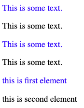
- 방문한 링크와 미방문 링크 스타일 구분하기
- focus가 잡혔을 때, 요소 스타일 주기
1 | /* unvisited link */ |
a:hover는 a:link, a:visited 속성 이후에 선언되어야한다. 또한 a:active 속성은 a:hover 속성 이후에 선언되어야 한다.
:first-child pseudo-class
요소의 첫번째 자식을 선택하는 선택자이다.
1 |
|
이 외에도 많은 pseudo-class들이 있으니 필요하면 찾아서 사용하자.
pseudo-element
요소의 특정 부분을 스타일링 하기 위해 사용하는 CSS 속성이다.
- 요소의 첫번째 줄이나 첫문자를 스타일링 하기
- 요소 content의 이전이나 이후에 content를 삽입하기
::first-line
첫번째 줄의 특별한 스타일링을 추가하기 위해 사용한다.
- block level 요소에만 설정 가능하다.
1 | p::first-line { |
::first-letter
첫번째 문자를 스타일링 하는데 사용된다.
- block level 요소에만 설정 가능하다.
1 | p::first-letter { |
::before
요소의 content 이전에 어떤 content를 삽입하기 위해 사용한다.
1 | h1::before { |
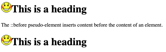
::after
요소의 content 이후에 어떤 content를 삽입하기 위해 사용한다.
1 | h1::after { |
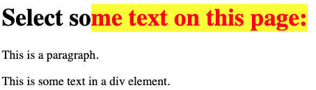
::selection
사용자에 의해 선택된 부분을 스타일링한다. 아래는 드래그하여 텍스트를 선택하였을 때의 상황이다.
1 | ::selection { |