input에 입력값을 입력하기 전까지 placeholder는 사라지지 않는다.
이는 input 창이 포커싱되어있는지 헷갈리게 할 수 있어 UX를 떨어뜨릴 수 있다.
1 | input:focus::-webkit-input-placeholder, |
- 크로스 브라우징을 고려하여 CSS를 추가해주었다.
- 포커스가 되었을 때, placeholder 색상을 투명하게 설정하도록 해준다.
input에 입력값을 입력하기 전까지 placeholder는 사라지지 않는다.
이는 input 창이 포커싱되어있는지 헷갈리게 할 수 있어 UX를 떨어뜨릴 수 있다.
1 | input:focus::-webkit-input-placeholder, |
CSS로 작업을 하다가 경계가 검정색 바탕 부분과 border에 약간의 단차가 생기는 문제가 있었다.
마크업 구조는 다음과 같다.
1 | <div> |
1 | box-shadow: 0 0 0 1px gray inset; |
1 | <ul class="grid"> |
1 | .grid { |
1 | .grid:hover .grid__child:not(:hover) { |
하지만 한가지 문제점은 grid의 gap이 있을 경우 item에 마우스가 올라갔을 때 뿐만 아니라 gap에 마우스가 올라갔을 때에도 해당 css가 적용된다.
이를 해결하기 위해서 부모 요소에는 pointer-events: none을 주고 자식 요소에는 pointer-events: auto를 줘서 해결할 수 있다.
1 | .grid { |
pointer-events: none 속성은 hover이벤트 뿐만 아니라 다른 모든 이벤트도 무시한다. 그래서 scroll이 되어야하는 경우에 스크롤이 되지 않는 문제가 발생할 수 있다.
이를 해결하기 위해서는 해당 부모요소를 감싸는 container 박스를 생성하는 것이다.
1 | <div class="container"> |
1 | .container { |
overflow:auto 속성을 주면 스크롤도 작동하고 gap 부분에서 hover 이벤트도 방지할 수 있다.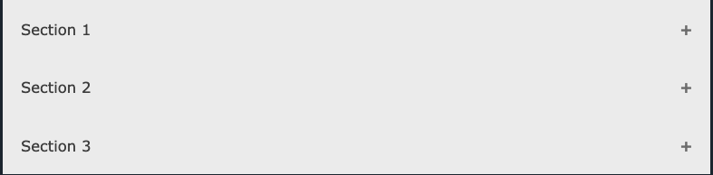
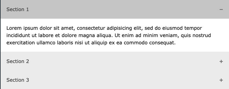
1 | <button class="accordion">Section 1</button> |
1 | .accordion { |
1 | // Accordion.jsx |
기본적인 HTML구조와 CSS로 다음과 같은 form을 만들 수 있다.
1 |
|
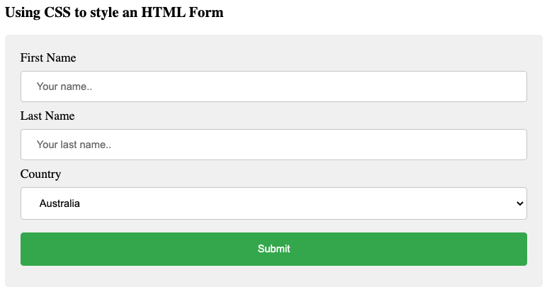
1 | input[type="text"]:focus { |
1 | input[type="text"] { |
1 | input[type="text"] { |
1 | textarea { |
1 | * { |
1 | <h2>Responsive Form</h2> |
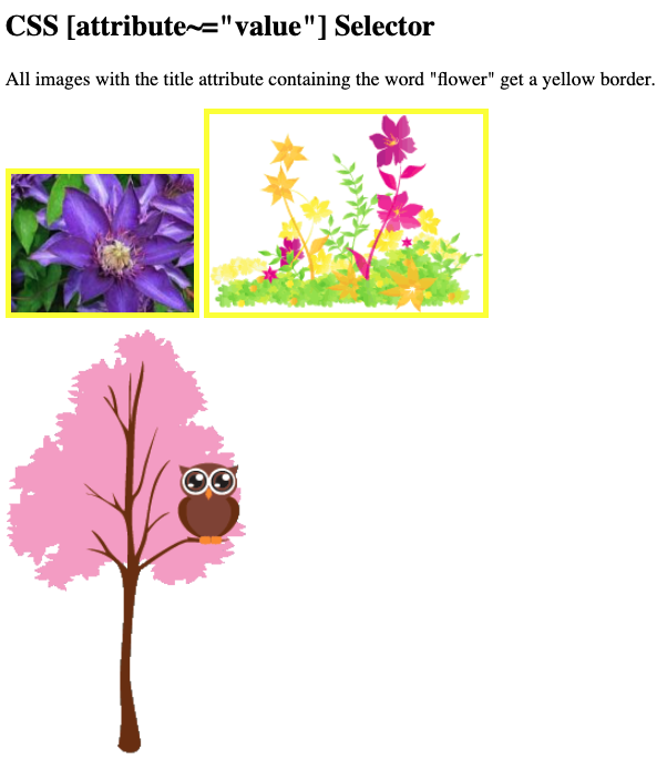
특정 attribute를 선택하기 위해 사용하는 선택자이다.
1 | a[target] { |
1 | a[target="_blank"] { |
1 | [title~="flower"] { |
1 | <h2>CSS [attribute~="value"] Selector</h2> |
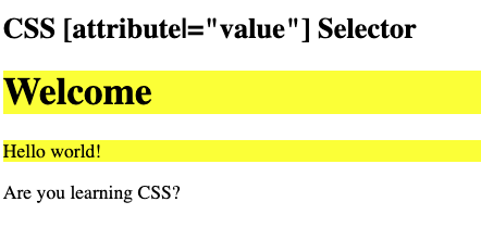
띄어쓰기로 구분된 요소는 개별요소로 취급하짐나, 하이푼(-)으로 구분된 요소는 여기서 제외된다.
1 | [class|="top"] { |
1 | <h2>CSS [attribute|="value"] Selector</h2> |
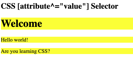
1 | [class^="top"] { |
1 | <h2>CSS [attribute|="value"] Selector</h2> |
1 | [class$="test"] { |
1 | [class*="te"] { |
이미지 스프라이트는 단일 이미지에 포함된 이미지 모음이다.
이미지가 많은 웹 페이지 로드하는데 많은 시간이 걸릴 수 있고 서버 요청도 여러번 발생할 수 있다.
이미지 스프라이트를 사용하면 서버 요청 수가 줄어들고 대역폭이 줄어든다.
3개의 이미지를 사용하는 대신, 하나의 이미지를 사용한다.
그리고 나서 CSS로 보여주고 싶은 부분만 보여준다.
1 | <img id="home" src="img_trans.gif" width="1" height="1" /> |
1 | #home { |
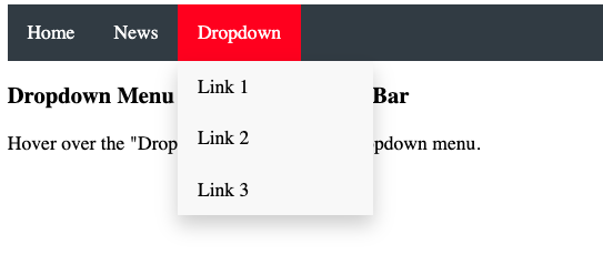
CSS만을 이용하여 dropdown을 구현해보자.
1 | <style> |
우선 dropdown content를 열기 위한 span, button 요소를 사용한다.
dropdown content는 div같은 컨테이너 요소를 사용한다.
dropdown content를 CSS에 정확하게 배치하기 위해 1,2번을 div로 감싼다.
wrapper div에는 position:relative 속성을 주어 기준이 되도록 하며 dropdown content에는 position:absolute 속성을 주어 dropdown button 바로 아래에 위치하도록 한다.
dropdown content는 hidden 속성이 기본값이다. 그리고 hover시 아래에 보이도록 한다. 그리고 min-width 속성을 줘서 width를 갖게 한다.
이때, dropdown button 만큼 넓게 width를 갖게 하고 싶다면
width:100%로 설정해라. 작은 화면에서 스크롤을 활성화 시키려면overflow:auto를 설정하라.
border를 설정하는 것 대신 box-shadow 속성으로 카드처럼 보이게 할 수 있다.
hover 속성은 dropdown menu를 보여줄 때 사용된다.
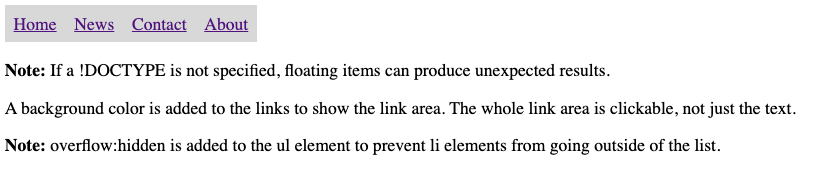
Navigation Bar는 link의 목록들이다.
1 | <ul> |
기본적인 list 스타일을 제거하기 위한 CSS는 다음과 같다.
1 | ul { |
1 | ul { |
추가로 active 클래스를 추가하여 현재 선택된 link를 표시해줄 수 있다. JavaScript 사용해야한다.
1 | li a.active { |
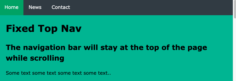
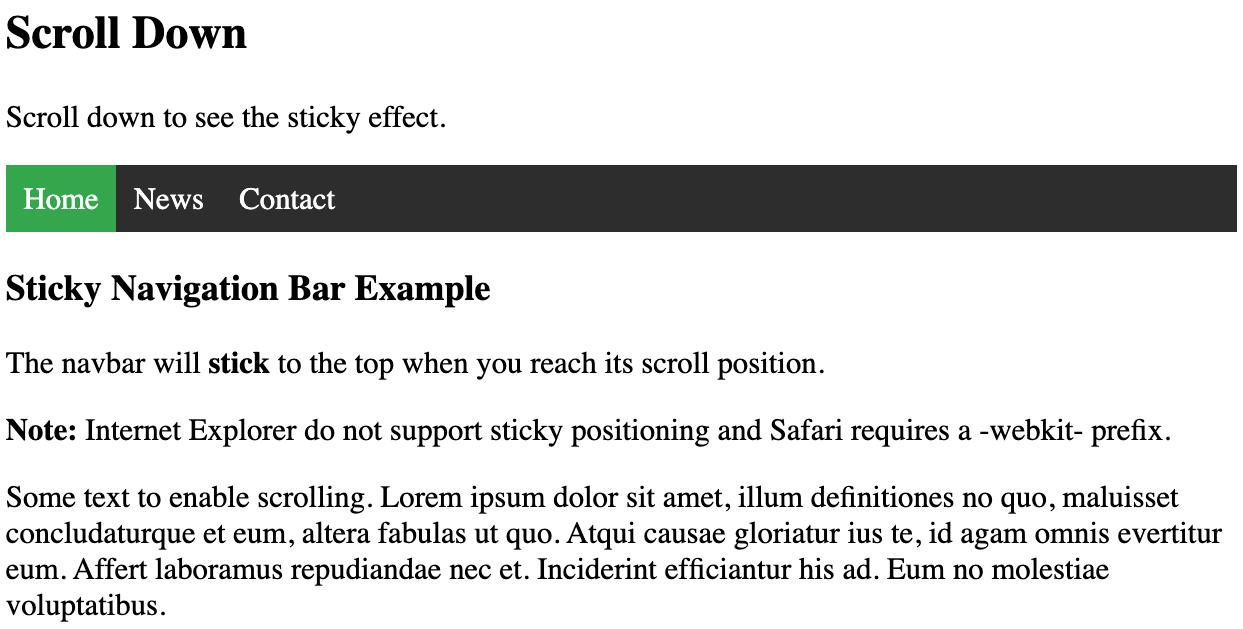
sticky side 네비게이션 바를 만드는 방법이다.
1 | ul { |
1 | li { |
1 | li { |
1 | ul { |
1 | ul { |
IE는 sticky를 지원하지 않는다. Safari는 -webkit- prefix가 필요하다. 또한 top, right, left, bottom 중 적어도 하나는 지정해줘야한다.
1 | <ul> |
1 | ul { |
author.bio
author.job