<오늘부터 CSS 마스터 19일차> Accordion
Accordion
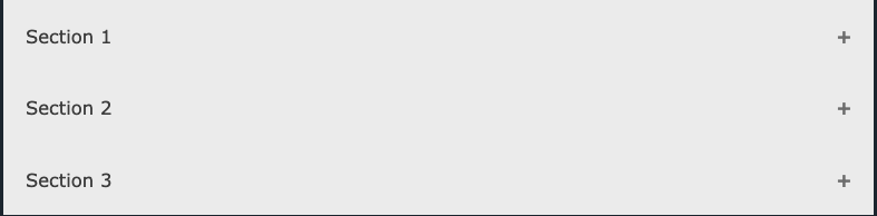
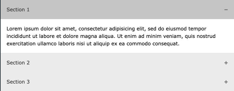
1. HTML 마크업 설계
1 | <button class="accordion">Section 1</button> |
2. CSS 스타일링
1 | .accordion { |
3. React 로직
1 | // Accordion.jsx |
1 | <button class="accordion">Section 1</button> |
1 | .accordion { |
1 | // Accordion.jsx |
author.bio
author.job