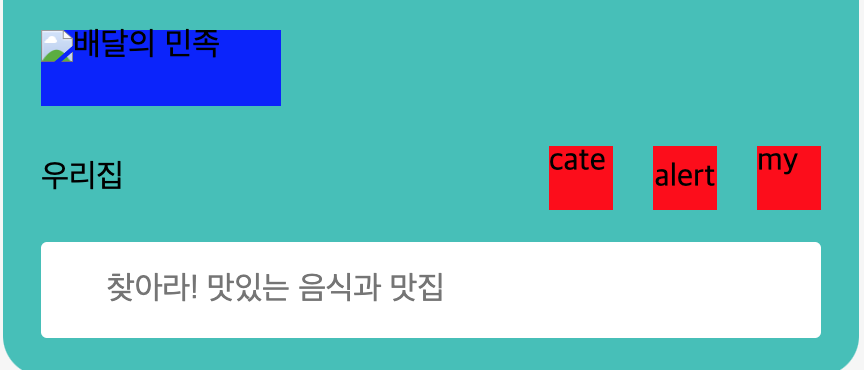
오늘 공부한 것 배달의 민족 프로젝트 inline 요소 layout 배치
마크업 1 2 3 4 5 6 7 8 9 10 11 12 13 14 15 16 17 18 19 20 21 22 23 24 25 <header class ="header" > <h1 class ="header__logo" > <a class ="logo__link" href ="/" > <img class ="logo__img" src ="/" alt ="배달의 민족" /> </a > </h1 > <div class ="nav-wrapper" > <button class ="header__address-button" > 우리집</button > <a class ="category" href ="/" > cate</a > <button class ="header__alert-button" > alert</button > <a class ="mypage" href ="/" > my</a > </div > <form class ="search-form" action ="" > <fieldset > <legend class ="sr-only" > 검색 폼</legend > <label class ="sr-only" for ="" > 검색</label > <input class ="search-form__input" placeholder ="찾아라! 맛있는 음식과 맛집" type ="search" /> <button class ="search-form__button-submit" type ="submit" > </button > </fieldset > </form > </header >
button, a 태그 둘다 인라인 요소이므로 한줄을 전부 차지하는 block 요소와 다르게 컨텐츠의 크기만큼 width,heigth를 가진다.
sass 1 2 3 4 5 6 7 8 9 10 11 12 13 14 15 16 17 18 19 20 21 22 23 24 25 26 27 28 29 30 .header { background : $mainColor ; padding : rem (19px ); border-radius : 0 0 20px 20px ; & .nav-wrapper { display : flex; flex-flow : row nowrap; } &__address-button { @include size(rem(120px ), rem(32px )); background : transparent; border : 0px solid black; margin-top : rem (20px ); text-align : left; margin-right : auto; } & .category , &__alert-button , & .mypage { @include size(rem(32px ), rem(32px )); background : red; border : 0 ; margin-top : rem (20px ); } &__alert-button { margin-left : rem (20px ); margin-right : rem (20px ); }
button,a 태그들을 좌우배치하기 위해 이들을 div로 감싸고 부모요소에게 flex를 주었다.
button, a 태그 각각 width, heigth를 주었다.
💡 width,heigth 주지 않으면 컨텐트 크기만큼 width를 가진다. 또한, flex의 기본속성이 stretch여서 부모요소 높이만큼 자식요소도 쭈욱 높이가 늘어나게 된다.
a,button 태그들이 flexible 속성으로 변하게 되면서 각 content만큼 width를 갖는 inline-block 요소로 변한다.
flex 요소들이 직접 width를 가지거나, 컨텐츠 크기만큼 width를 가졌을 때, 결국 각자의 width를 가지고 있기 때문에 요소들에게 margin auto 속성 을 적용하여 좌우 배치할 수 있다.
자주 쓰는 :nth-child() 1 2 3 4 5 6 7 8 9 10 11 12 13 14 <address class ="address" > <span > (주)우아한형제들</span > <span > 대표이사 김범준</span > <span > 사업자등록번호 120-87-65763</span > <span > 통신판매업 서울 송파-0515</span > <span > 호스팅서비스제공자 (주)우아한형제들</span > <span > <a href ="CS@woowahan.com" > CS@woowahan.com</a > </span > <span > 서울특별시 송파구 위례성대로 2 장은빌딩</span > <span > 전자금융분쟁처리 Tel <a href ="tel:1600-0987" > 1600-0987</a > (유료), <a href ="080-849-0987" > 080-849-0987</a > (무료)</span > <span > Fax <a href ="fax:050-6050-0400" > 050-6050-0400</a > </span > </address >
위 마크업 처럼 address 안에 span 태그의 형제요소들이 많이 있을 때, 내가 원하는 순서의 span 태그에만 스타일링 주고 싶을 때 사용
3번째 포함 그 이후 요소 1 2 span :nth-child (n + 3 ) {}
3번째 부터 5번째 요소 1 2 span :nth-child (n + 3 ):nth-child (-n + 5 ) {}
짝수 및 홀수 요소 1 2 3 4 5 span :nth-child (odd) {} span :nth-child (even) {}
함수형 요소 1 2 span :nth-child (3 n + 1 ) {}
::after,before로 세로선 스타일링
1 2 3 4 5 6 7 8 9 li :nth-child (n + 2 )::before { content : "" ; position : absolute; width : 1px ; height : 90% ; background : $gray-100 ; top : 0 ; left : -6px ; }
2번째 li 태그부터 끝까지 before 선택자로 선택하였다.
position : absolute 를 주고 배치를 맞춘 뒤 배경색을 채우고 width,height를 설정하여 선처럼 보이게 하였다.
💡 이 때, 부모 요소에게 position : relative 속성을 줘야 부모를 기준으로 배치할 수 있다.
오늘 소감 내일은 1달간 HTML/CSS 수업에 대한 미니 프로젝트 발표가 있는 날이다. 수업동안 상대적으로 어려운 예제를 다루다가 일반적인 레이아웃을 다루니 쉽게 레이아웃은 쉽게 느껴졌다. 하지만, 여전히 제일 어려운 것은 마크업인 것 같다. 논리적인 순서에도 맞아야 하며 배치도 적절하게 되게끔 마크업을 설계하는 것이 매우 중요하다고 생각이 들었다.
중간중간 CSS 스타일링에 대해 막혔었던 부분도 TIL을 작성하며 정리하니 나중에 찾아보기도 편하고 기억에 오래 남을 것 같다.